


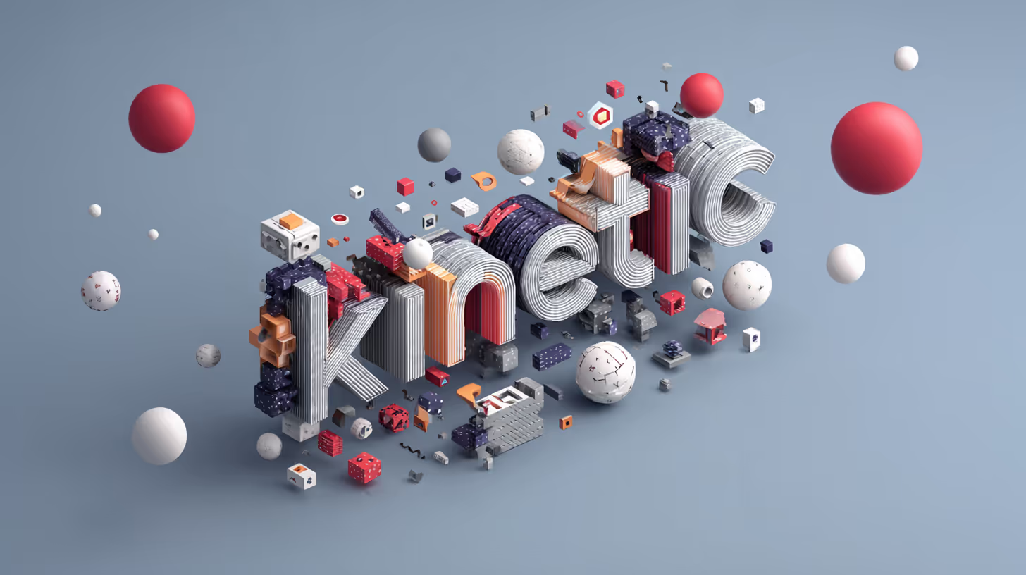
Kinetic Typography: Making Text Move Emotionally
It’s Not Just What You Say... It’s How It Moves
Kinetic typography is the art of making words move in a way that communicates more than their literal meaning. It’s one of the most versatile and expressive tools in a motion designer’s kit, and when done well, it turns simple type into a living, breathing character in your animation.
Whether you’re crafting a slick explainer, a hyped-up social ad, or an emotionally charged lyric video, the way your type moves changes how your message feels.
Why Motion + Type = Magic
We often say, "good typography speaks." But kinetic type performs. It gives pace to narration, drama to data, and visual rhythm to everything in between.
Kinetic Type Can:
- Add emphasis and tone to dialogue or narration
- Replace the need for voiceover in silent videos
- Sync with beats or transitions to add musicality
- Reinforce brand personality through motion behaviour
In short: text doesn’t just sit there. It speaks. It dances. It reacts.
Real Client Example: EdTech Brand Explainer
We created a 90-second explainer video for an EdTech platform aimed at high schoolers. They wanted the message to be clear, energetic, and upbeat, without using voiceover.
We leaned into kinetic type:
- Used scaling and squash/stretch to mimic enthusiasm
- Timed type pops to rhythmic music
- Built transitions between text blocks using directional movement (left-to-right = progression)
This created a sense of voice and clarity without a single line of dialogue.
Types of Kinetic Typography
1. Motion-Synced Type
- Moves in sync with narration or music
- Great for lyric videos, trailers, or marketing spots
2. Expressive Type
- Moves based on emotion or tone
- Think of jittery type for anxiety, bouncy type for excitement
3. Narrative Type
- Helps drive a story forward
- Often used in poetic shorts or branded storytelling
Our Go-To Techniques & Tools
- Overshoot & settle: Adds bounce and realism
- Tracking & kerning animation: Controls pacing and emotion
- 3D camera rigs in After Effects for parallax and spatial motion
- Animography & Red Giant Universe: For plugin-based type tools
We often start with rough animatics using type and music only (no voice, no visuals) to build rhythm before adding anything else.
Kinetic Type Pitfalls (and How to Avoid Them)
- Overdoing It: Just because the type can move doesn’t mean it should. Choose your moments.
- Style vs Substance: Cool animation won’t save a weak message.
- Inconsistent motion logic: Keep consistent easing, direction, and behaviour unless you’re breaking it intentionally.
Final Thought
Kinetic typography isn't just decoration—it's narrative. Done right, it builds trust, adds energy, and creates a voice for your video even when it's silent. It's also one of the most efficient ways to communicate complex ideas in short attention spans.
So go ahead—let your type speak up. Or whisper. Or scream. Just make sure it moves like it means it.
Further Reading & Inspiration:
- Animography Animated Typefaces
- The Art of Kinetic Typography (Motionographer)
- Red Giant Universe Typographic Tools

Start a

with us
