


Here’s what your colour choices say about your brand
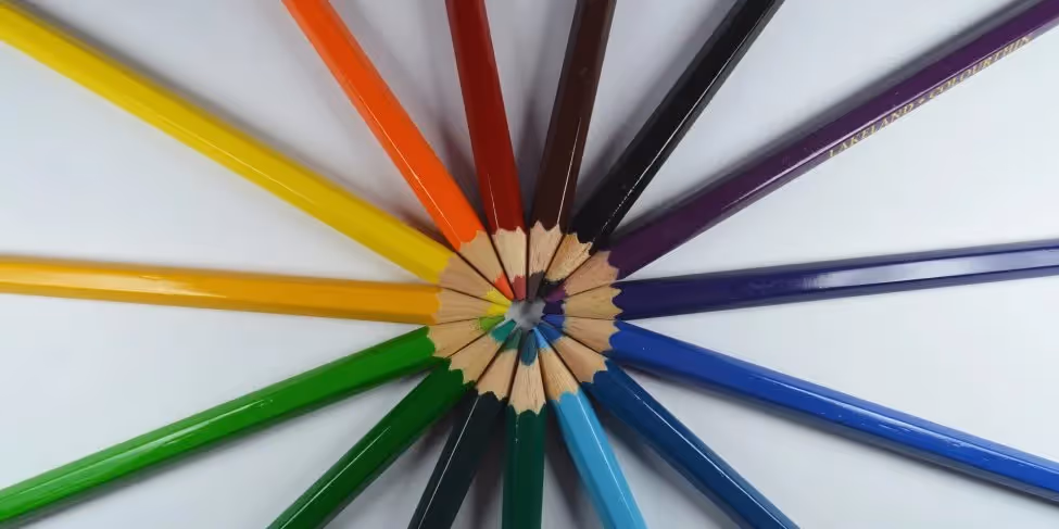
The great thing about animated explainer videos is that colour design knows no bounds. You want a character with blue skin and pink hair? You got it. You want a black and white background with bright multicoloured accents bursting out whenever you want to draw attention to something on screen? No problem. You want a character to change colour based on their emotional state? That’s a great idea! But before your start throwing literal paint buckets around it’s wise to consider what your colour use will say about your content. Each colour holds deeper meanings, and the context in which we use them can drastically change the message we’re trying to convey. Let’s take a look at a few of the hidden effects your colour choices can have on your video, your message, and your brand as a whole.
1) the colour coding of nature
Call us all monkey-brained neanderthals, but evidence shows it’s hard for us humans to get away from the colour associations found in the raw basics of nature. After all, colour can be a good indicator of what foods, plants, and animals will be safe or deadly out in the wild – it only makes sense that we’ve developed subconscious associations for each one. Context is key here: for example, imagine you’re in a supermarket. Strong green colours in the fresh produce aisle are a good thing where we want to be reminded of lush, freshly picked vegetables… but not so much in the bakery section, where green packaging is more likely to trigger memories of a long forgotten muffin gone mouldy. When developing colour palette ideas for your next explainer video, consider the nature-found associations with your brand, event, and/or product and the implications of your choices.
2) colour psychology
From the time we’re relatively young, we (in western culture) come to associate deep blue with sadness, green with jealousy, yellow with cowardice, black with mourning, and red with anger. Some colours are more emotionally elusive, for example: what do you associate with the colour orange? How about teal? Got any strong feelings about maroon? Colour psychology suggests that different hues have a subconscious effect on our senses, perceptions, and emotions. There are many associations with each colour, some more scientifically sound than others and some affecting only certain areas of culture. Red is a strong colour, thought to attract impulse buyers, increase metabolism and appetite, and stimulate feelings of desire. Meanwhile blue acts as a depressant, causing calm, relaxation, and even being used municipally in attempts to lower crime (https://web.archive.org/web/20100913151600/http://seattletimes.nwsource.com/html/nationworld/2008494010_bluelight11.html). Give some time toward studying the varying emotional effects of colour to see how it aligns with your brand message.
3) societal expectations of colour
A more nuanced point about the use of colour in video content arises when we start using societal perceptions of certain colours to represent particular cultural and demographic groups. For example, is it currently, always, or never acceptable in today’s age to use pink to represent female characters and blue for males, most especially when gender isn’t an integral part of the video? A conservative skewing audience is likely to respond very differently to such uses than a progressive or left-leaning one. Though shorthand uses of colour can be found perfectly acceptable in one time, place, or culture, these stereotypes can become controversial over time, begging the need for regular re-evaluation of target audience values and cultural brand identity.
4) choosing colours for different jobs
Along with their inherent meanings, colours can be used to perform particular ‘jobs’ within your specific video content. General information text will likely be coloured (or bordered by a colour) differently to the call of action, just like the main character in a film always tends to stand out against the forgettable backdrop of extras. [link] The knee jerk tendency is to colour any call of action in bright red to capitalise on the impulse and urgency of the colour. However this doesn’t always have to be the case, and many times isn’t even the best decision. Sometimes red doesn’t fit your brand’s colour scheme, doesn’t stand out, or doesn’t align at all with the mood of your call to action. Consider a video explaining the benefits of attending a mental health service for anxiety or depression. For this particular clientele urgency and impulse are the last things they want to sign up for. Attending the service may be a decision that doesn’t come lightly, and one which commands using a soothing blue or soft yellow to highlight the contact details.
5) colour and lighting go hand in hand
Might seem obvious, but your colour choices will directly affect your viewers’ perceptions of the lighting in your video. This affects the intended location of your video (tip: the relative warmth or coolness of your chosen colour palette will affect whether the lighting looks artificial for indoors or natural for outdoors), the time of day (tip: sunrise and sunset colours are starkly different to noon colours due to the amount of air the sunlight needs to pass through, and even sunrise and sunset have their own distinctive palettes from each other, with sunrise being associated with brighter yellows, pinks and blues, and sunset holding a warmer, darker palette of red, orange, and even purple), and the general visibility (tip: often purple and blue colourisation help depict night time much more effectively than pure black overlays because it imitates our ‘tinted’ perception of nighttime lighting – that feeling when your eyes adjust to the darkness).
6) a colour is only as good as its neighbour
So… we all remember The Dress, right? The photo that went viral in 2015 because the world couldn’t agree on whether a lace dress was black and blue, or white and gold? It did, in reality, turn out to be black and blue (much to my dismay) – but the intrigue of the optical illusion continued on as it revealed just how differently we can perceive lighting from person to person. The trick in this and other colour optical illusions is that the ‘true’ colour of an object in an image can be made to look another colour entirely simply by placing it next to a colour which will affect our perception of the lighting (rather than the true colour) – an example of what’s referred to as colour constancy (https://en.wikipedia.org/wiki/Color_constancy). Be aware of what your video colours are conveying not just on their own but especially in context with each other.

Start a

with us
